Principles of Design
Balance
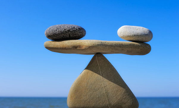
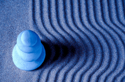
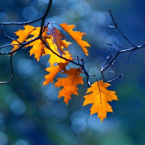
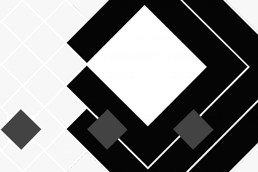
Balance in design is similar to balance in physics. A large shape close to the center can be balanced by a small shape close to the edge. A large light toned shape will be balanced by a small dark toned shape (the darker the shape the heavier it appears to be). [Description Link]
Balance in design is similar to balance in physics. A large shape close to the center can be balanced by a small shape close to the edge. A large light toned shape will be balanced by a small dark toned shape (the darker the shape the heavier it appears to be). [Description Link]
Gradation
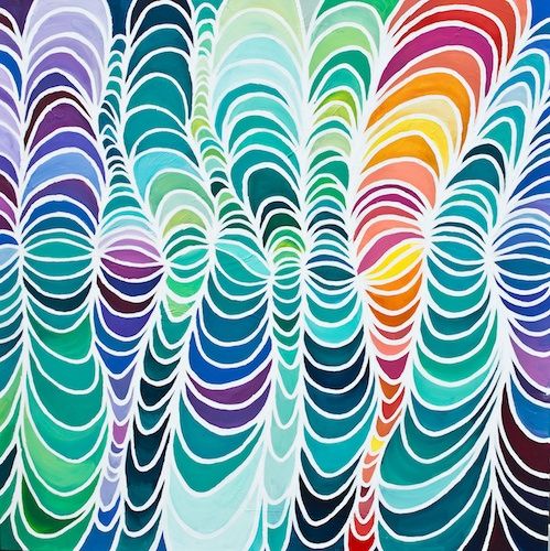
Gradation of size and direction produce linear perspective. Gradation of colour from warm to cool and tone from dark to light produce aerial perspective. Gradation can add interest and movement to a shape. A gradation from dark to light will cause the eye to move along a shape. [Description Link]
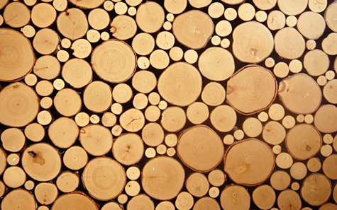
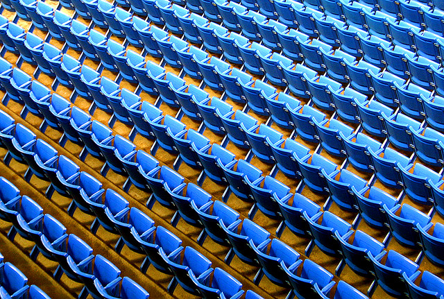
Repetition
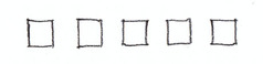
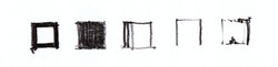
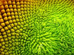
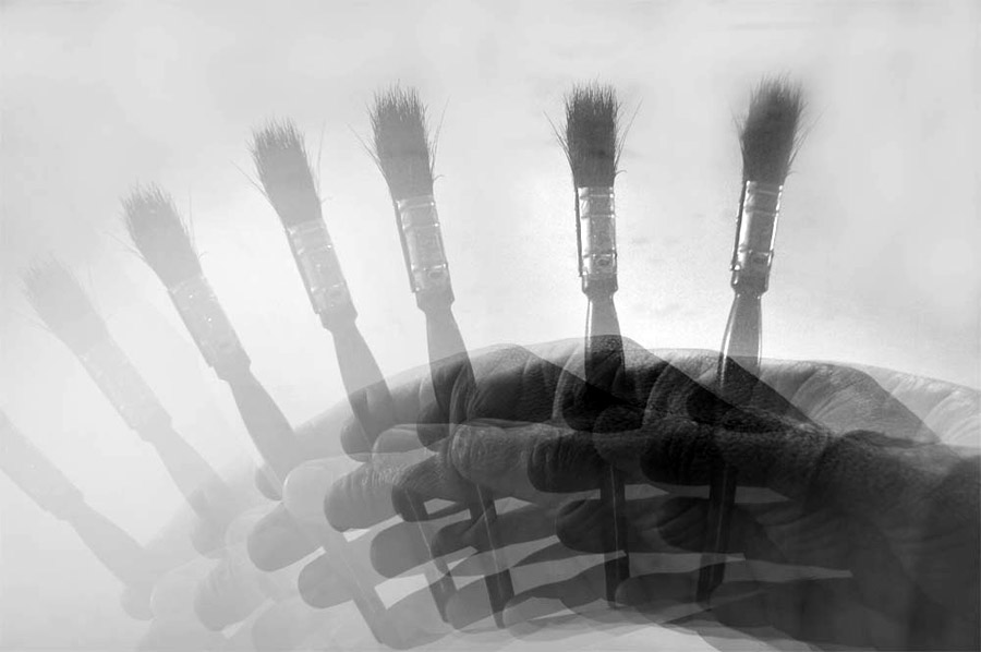
Repetition with variation is interesting, without variation repetition can become monotonous. The five squares above are all the same. They can be taken in and understood with a single glance. When variation is introduced, the five squares, although similar, are much more interesting to look at. They can no longer be absorbed properly with a single glance. The individual character of each square needs to be considered. If you wish to create interest, any repeating element should include a degree of variation. [Description Link]
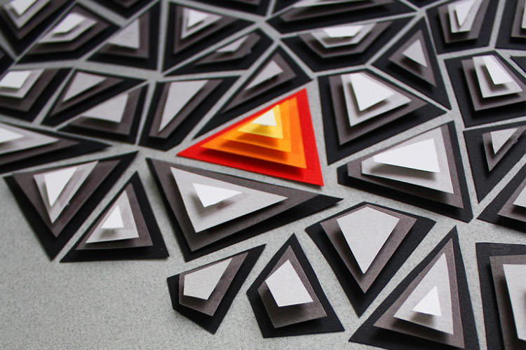
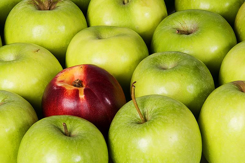
Contrast
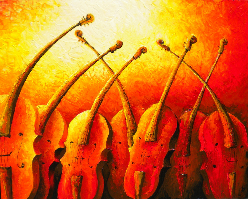
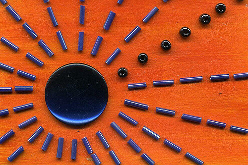
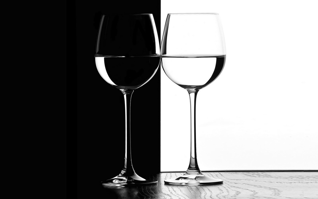
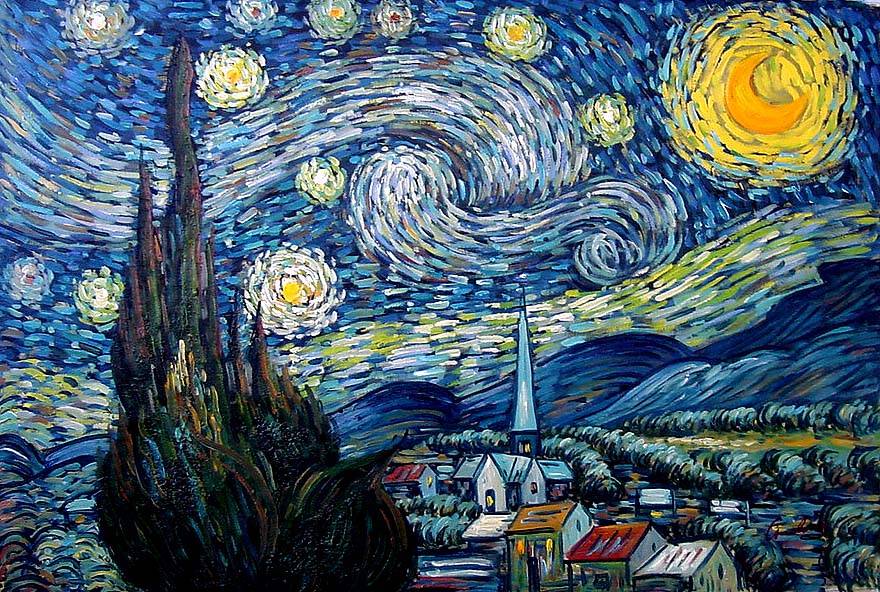
Contrast is the juxtaposition of opposing elements eg. opposite colours on the colour wheel - red/green, blue/orange etc. Contrast in tone or value - light / dark. Contrast in direction - horizontal/vertical. The major contrast in a painting should be located at the center of interest. Too much contrast scattered throughout a painting can destroy unity and make a work difficult to look at. Unless a feeling of chaos and confusion are what you are seeking, it is a good idea to carefully consider where to place your areas of maximum contrast. [Description Link]
Contrast is the juxtaposition of opposing elements eg. opposite colours on the colour wheel - red/green, blue/orange etc. Contrast in tone or value - light / dark. Contrast in direction - horizontal/vertical. The major contrast in a painting should be located at the center of interest. Too much contrast scattered throughout a painting can destroy unity and make a work difficult to look at. Unless a feeling of chaos and confusion are what you are seeking, it is a good idea to carefully consider where to place your areas of maximum contrast. [Description Link]

Harmony
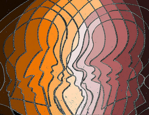
Harmony in painting is the visually satisfying effect of combining similar, related elements. eg.adjacent colours on the colour wheel, similar shapes etc. [Description Link]
Harmony in painting is the visually satisfying effect of combining similar, related elements. eg.adjacent colours on the colour wheel, similar shapes etc. [Description Link]
Dominance
Dominance gives a painting interest, counteracting confusion and monotony. Dominance can be applied to one or more of the elements to give emphasis. [Description Link]
Dominance gives a painting interest, counteracting confusion and monotony. Dominance can be applied to one or more of the elements to give emphasis. [Description Link]
Unity
Relating the design elements to the idea being expressed in a painting reinforces the principal of unity (Example: a painting with an active aggressive subject would work better with a dominant oblique direction, course, rough texture, angular lines etc.) whereas a quiet passive subject would benefit from horizontal lines, soft texture and less tonal contrast. Unity in a painting also refers to the visual linking of various elements of the work. [Description Link]
Relating the design elements to the idea being expressed in a painting reinforces the principal of unity (Example: a painting with an active aggressive subject would work better with a dominant oblique direction, course, rough texture, angular lines etc.) whereas a quiet passive subject would benefit from horizontal lines, soft texture and less tonal contrast. Unity in a painting also refers to the visual linking of various elements of the work. [Description Link]